A culture in motion
Identity built for the board
The Challenge
Create a surf and skate brand that feels genuinely connected to board culture, while standing apart from the familiar visual language of the industry. The identity needed to feel energetic and adaptable, with enough flexibility to work across everything from boards and apparel to products and print.
The Solution
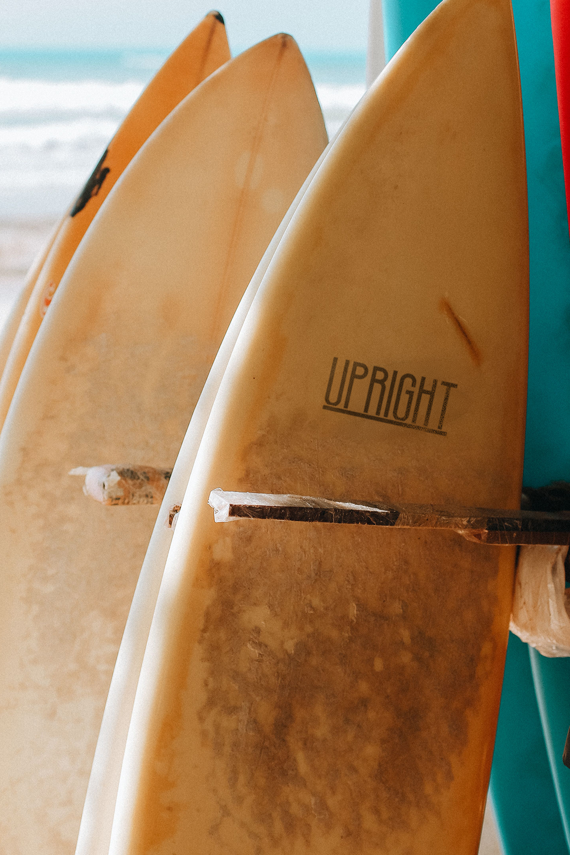
A brand identity built for those who live and breathe surf and skate culture — from boards and gear to the people cutting up waves and streets. The identity was developed to carry consistently across products, apparel and print, creating a cohesive brand that feels at home both on the board and beyond it.
The Outcome
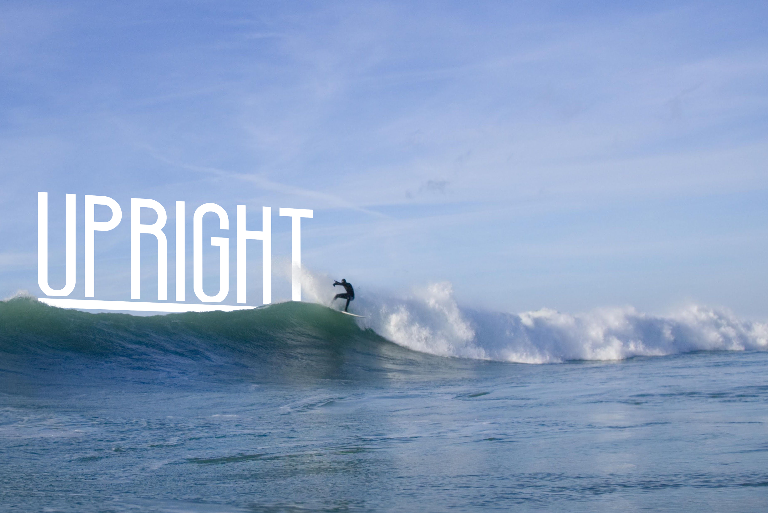
A strong identity built around the idea of movement and progression. The tall, upright form of the wordmark reinforces the name itself, drawing on the act of standing, balancing and progressing on a board. Its distinctive proportions give the brand a recognisable presence with a sense of height, energy and forward motion.

Colour and pattern
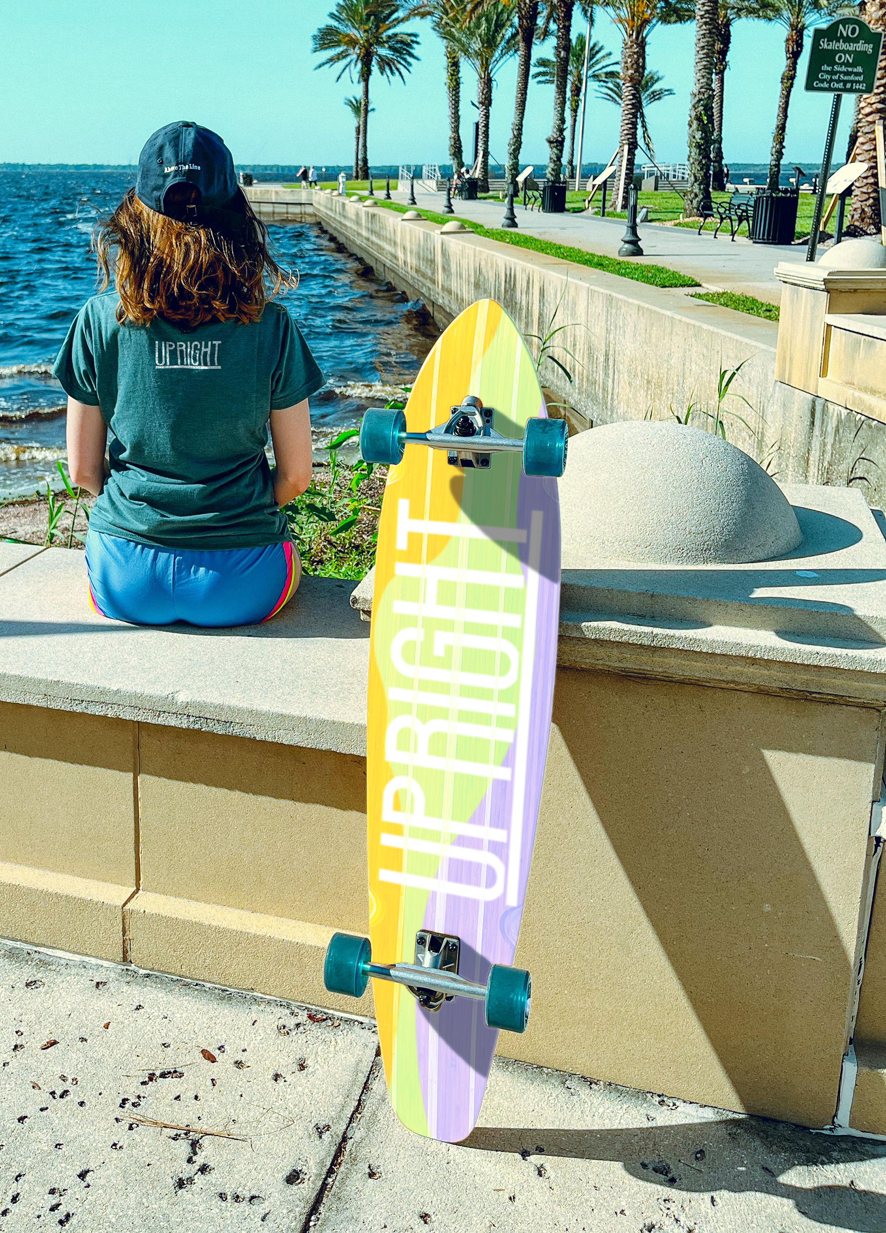
A vibrant palette brings energy to the Upright identity, with colours designed to come alive in the sunlight. The flowing pattern draws from waves, terrain and the paths we carve through them, creating a sense of movement that can carry across boards, packaging and print.
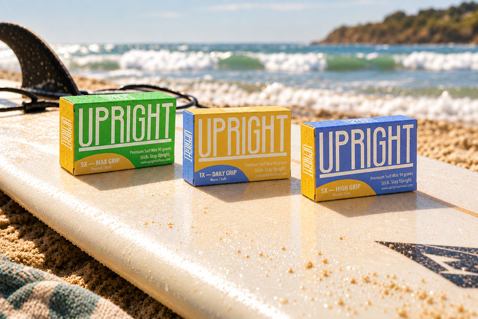
Products and packaging
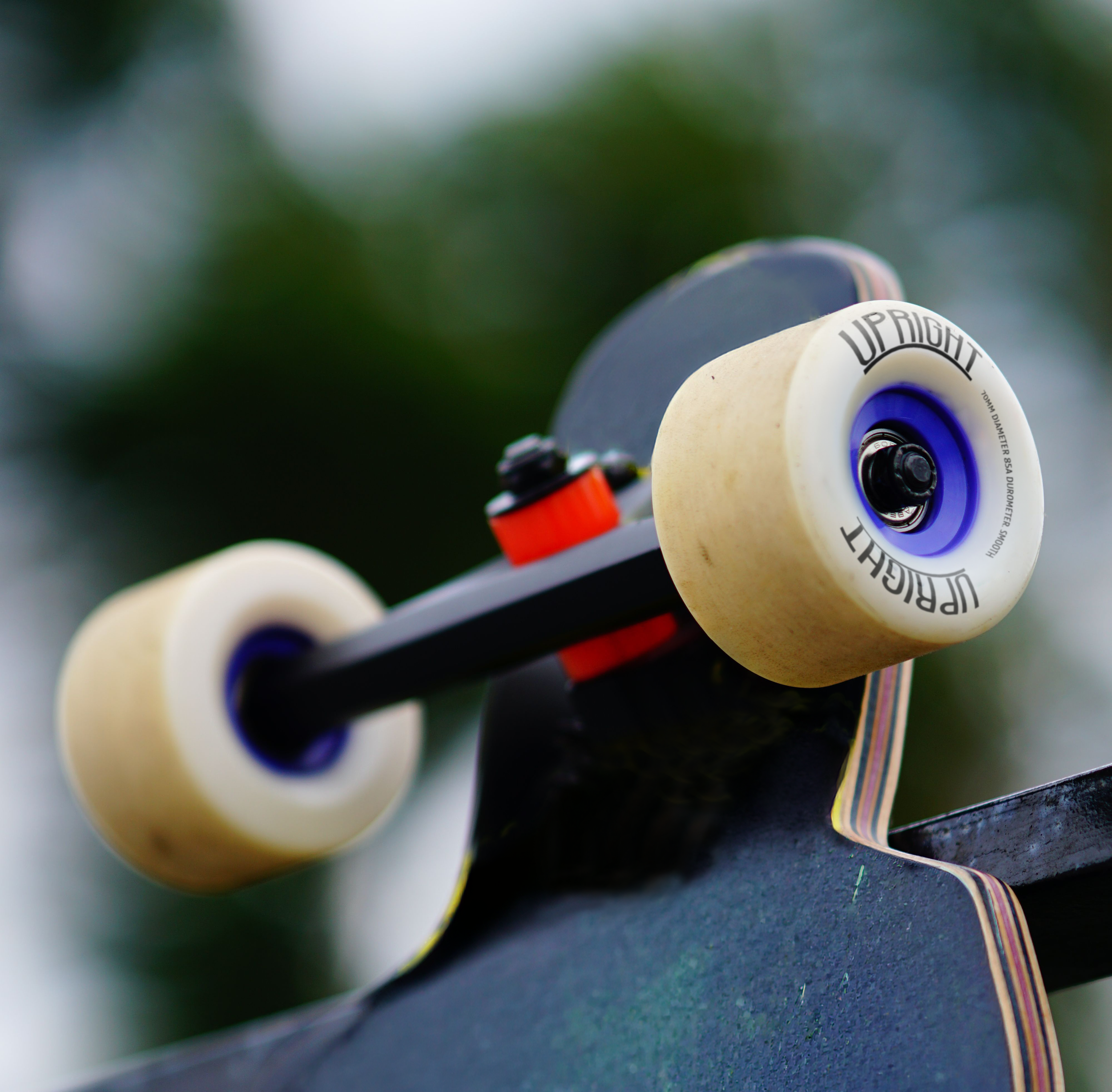
From boards to wax, surfwear and everyday accessories, the Upright identity finds its place across the whole surf and skate lifestyle. Each product brings the brand to life in its own way, while keeping the visual attitude strong from the beach to the streets.
Printed material
Printed material brings the Upright identity into the physical world, giving the brand another way to connect with its surf and skate culture. From magazine spreads to printed collateral, the clean typography and vibrant colour system create a consistent visual experience across every piece.